

Google Style Slide Away Form Labels

The slide away form labels made popular by Google and others is a fantastic design element that has grown in popularity over the past couple years. I recently had a client that specifically pointed out the Google Accounts login form fields and noted how much he liked that element. I have to admit, I like it too.

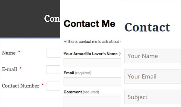
A simple solution to a longtime UI issue — “what the heck do I do with those form labels to keep them nicely on one line?” You could left align them to the field, but this of course introduces unsightly spacing and alignment issues due to the varying length of label text. You could use hang-on placeholders in lieu of labels — which works, but introduces other accessibility issues. You could stick them right above or below the fields, but this makes it difficult to condense the form.
Slide away labels solves all of these issues! There are many different versions of this feature, some more successful than others. This is my version of the solution.
Here is an example of what we will be building:
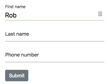
In this example, we use jQuery for its concise and cross-platform .focus() method, but you can use vanilla Javascript instead if that is what you prefer. First, we need to markup the form. We will use 3 fields and a button in this simple example. Each label and input is wrapped in a .field-wrapper class in order to provide a needed parent element for each field.
<form onSubmit="JavaScript:submitFunction()" id="contact-form" method="post">
  <div id="form">
    <div class="field-wrapper">
      <label>First name</label>
      <input
        id="firstName"
        required
        type="text"
        name="first_name"
        class="form-control"
      />
    </div>
    <div class="field-wrapper">
      <label>Last name</label>
      <input
        id="lastName"
        required
        type="text"
        name="last_name"
        class="form-control"
      />
    </div>
    <div class="field-wrapper">
      <label>Phone number</label>
      <input
        id="phoneNumber"
        required
        type="tel"
        name="phone"
        class="form-control"
      />
    </div>
  </div>
</form>
Next, some basic CSS to style the form. We also add our label transition animation. The label is set to pointer-events:none to allow the click to pass through to the input field.
#form{ margin-top:50px;}
.field-wrapper{ position:relative;}
label{
   position:absolute;
   top:7px;
   margin-top:0;
   pointer-events: none;
   -webkit-transition: all .2s ease-in-out;
   transition: all .2s ease-in-out;
   font-size:17px;
}
.form-control{
   padding:10px 0 0 0 !important;
   font-size:22px;
   border:none; /* remove the default field borders */
   border-bottom: 1px solid grey;
   background: white;
   height:auto;
   color:black;
}
.form-control:focus{
   border-bottom: 1px solid green;
   -webkit-box-shadow: none;
   box-shadow: none;
}
#btnSubmit{ margin-top:30px;}
.openup{ margin-top:-20px; font-size: 14px;}
Finally, we add our script. The idea here is that when the input field is selected, we attach an .openup class that initiates the transition. I usefocus() here instead of on() to support keyboard operations. Also, we update the underline to indicate the active input. Of course, you can style the active state however you like.
You may notice that I am setting the borders twice here. First I set all input field borders back to default grey, then I set the active field border state. I did this so that I don’t have to track the previously active input field.
$('.form-control').focus( function(e) {
   $(this).parent().find('label').addClass('openup');
   $('.form-control').css('borderBottom', '1px solid grey');
   $(this).css('borderBottom', '1px solid rgb(111, 189, 68)');  });
That's it! See it working in this Fiddle.
*Thanks /u/max_kek !